 |
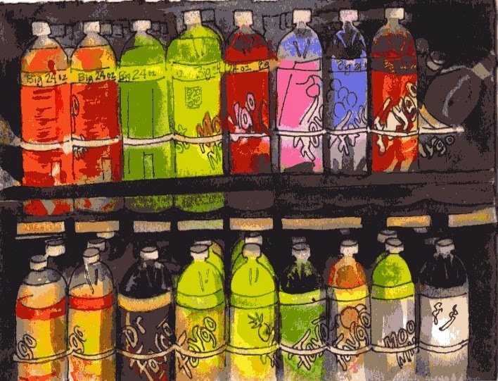
| Colorful drinks 5 1/2 "x 7 1/2 " |
As an artist, it surprises me sometimes where I notice colors. (Once I noticed some lovely contrasting colored garbage in the trash can at work) I also liked the bright colorful drinks in the cooler at a convenience store. I bet I'm the only person taking pictures of drinks in the cooler. Drawing the shapes was a bit boring though since they're identical. It was fun using bright colors and was mostly a study in something new that I've not painted before. It's good practice changing the subjects so I don't get in a rut.
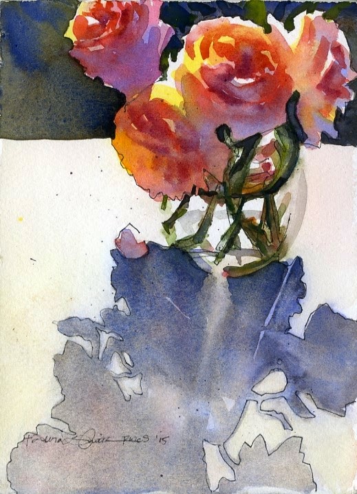 |
| Rose Study 5 1/2" x 7 1/2" |
I put bright colors (yellow and peach) on the roses first, then added darker colors on top after the first colors dried. I made up the dark background to contrast with the lights on the flowers. I like how the blue I added on the shadowed petals contrast cool (blue/purple) against warm (yellow/red/oranges) in the flowers. That usually works if you layer watercolors (called glazing) instead of adding the blue in the initial layer of color. Too much mixing of colors on your paintbrush usually makes mud.

No comments:
Post a Comment