 |
| Ron's Goats (5 1/2" x 8") |

Friday, December 18, 2015
Friday, December 11, 2015

Sunday, November 22, 2015
 |
| lily pad gazing (7 1/2 " x 11") After painting this, I wanted some highlights so I took a squeeze bottle with white gesso and lined the umbrella and inside of the lily pads. It kind of looks like I used elmer's glue. |
 |
| feeding time (5 1/2" x 8") |
 |
| Farm Lane (5 1/2 "x 8") -SOLD- |
 |
| Blue daisies (5 1/2" x 7") |
Sunday, November 8, 2015


Friday, November 6, 2015

Sunday, September 20, 2015

Sunday, September 13, 2015
 |
| begonias 6 "x 10 3/4" |
 |
| photo from York Art Assoc. watercolor class |
 |
| Sm practice sketch |
Tuesday, September 8, 2015
 |
| IN PROGRESS (begonias) |
Saturday, September 5, 2015
 |
| sunflowers in watering can 6" x 9" |
Thursday, September 3, 2015
 |
| adirondack chairs |
 |
| orange day lilies |
 |
| lilies |
The colors in the chair painting are like mush.
I couldn't decide which background color for the day lilies, and the other lilies have fun colors but the composition isn't good. These are all small 5 x 7s which helps in encouraging risk taking. I can cover these with white gesso and do another painting on top.
Sunday, August 30, 2015

Sunday, August 16, 2015
 |
| Water Lilies 2 |
Wednesday, August 12, 2015
 |
| Water Lilies #1 |
As a side note, thanks to all who came out to see me at the Lititz Art Show on July 25th. What a great day we had. God is good.
Sunday, February 8, 2015
 |
| Cyclamen (try #1) |
I drew the outline of a blue agate tea pot with cyclamen on plastic yupo paper. Then I painted watercolors on the paper and let it dry overnight. The colors spread on their own and made interesting patterns. I took a paint brush and removed the paint around the objects. These shapes are called Negative Shapes. It was fun to watch as the picture appeared out of the patterned paint but I'll probably try it again by washing off the colors and redoing it. This one got a little wild and might be hard to decipher the subject. Notice how the Cadmium yellow pushed the other colors around - this color does not play well with others.
 |
| Tulips |
Saturday, February 7, 2015

(Painting on Right) I put these colors on an illustration board covered with white gesso. I will chalk this up to practice and wash it off and try again. Sometimes you learn how NOT to do something when you try. I look for at least one area that I like instead of seeing everything I don't like.

Saturday, January 31, 2015
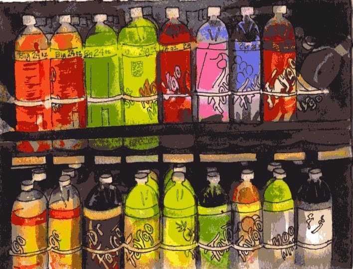 |
| Colorful drinks 5 1/2 "x 7 1/2 " |
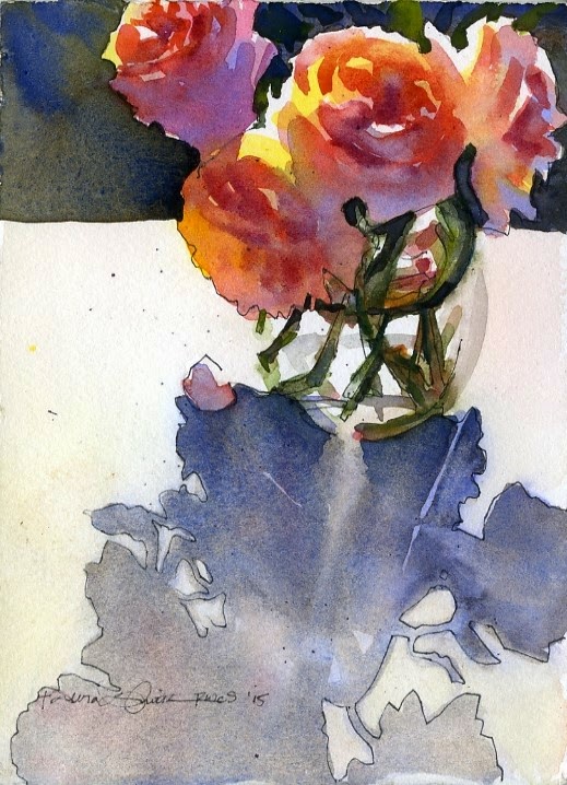 |
| Rose Study 5 1/2" x 7 1/2" |
I put bright colors (yellow and peach) on the roses first, then added darker colors on top after the first colors dried. I made up the dark background to contrast with the lights on the flowers. I like how the blue I added on the shadowed petals contrast cool (blue/purple) against warm (yellow/red/oranges) in the flowers. That usually works if you layer watercolors (called glazing) instead of adding the blue in the initial layer of color. Too much mixing of colors on your paintbrush usually makes mud.
Saturday, January 24, 2015
 |
| Dean and Kipper on the porch |
Monday, January 19, 2015
 |
| Photo of Dean and Kipper on our porch. |
 Watercolor on Yupo paper. I covered the whole sheet with mostly greens. When that was dry, I lifted off the paint in the shape of the porch post first. As I traveled across the paper, I lifted off the color in the shapes of the dog, then the flower box, relating each shape to the last one, trying to get the correct sizes. I like the shapes of the newspaper and legs. I like the look of untouched painted areas, so I left the porch swing as the original colors. Next, I need to lift off the paint where the bright siding shines through the plants. I think the shapes relate well with each other considering: I did no drawing on the paper before or during the process.
 Saturday, January 17, 2015

This is the journal that Lauren gave me for Christmas. I think that I finally understand it. It has lots of ways to get past your creative blocks and inhibitions, because every ounce of reason tells you NOT to tear the page out and chew it and NOT to take the book in the shower with you. (just two examples) Therefore, it helps you get past that reasoning voice when you go to paint/create.
 |
| One of the pages I did recently |
 |
| learning to paint watercolor on Yupo (plastic paper) I painted the whole chair, lifted out the chair's light areas and put in brighter colors just to see how I can manipulate the paint: to see if the colors would stay separate or run together. It all depends how wet the paint is. |
Subscribe to:
Posts (Atom)