Thursday, September 3, 2015

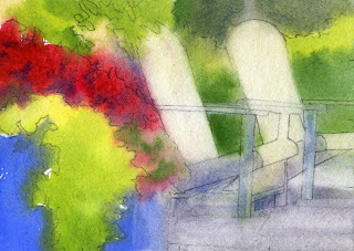
adirondack chairs

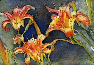
orange day lilies
lilies
I'm posting these three paintings to show that I do not paint a sellable image every time I put paint on paper. I consistently tell myself that there is a lot to learn from failures. (Mostly how NOT to do something) I will press on and try, try again.
The colors in the chair painting are like mush.
I couldn't decide which background color for the day lilies, and the other lilies have fun colors but the composition isn't good. These are all small 5 x 7s which helps in encouraging risk taking. I can cover these with white gesso and do another painting on top.

Sunday, August 30, 2015

Clematis flowers  (5 1/2" x 8")
I like when I give a boring photo a 2nd glance and paint it anyway.  That's when surprises happen.

Sunday, August 16, 2015

Water Lilies 2
I soaked the paper for a few minutes in water, drained it and it dried just enough to start painting. The paper was the perfect combination of damp enough to look like a wet-in-wet painting, yet dry enough that the paint stayed where I put it. I like the understated fish. I used to feel I needed to fill everything in, leaving nothing to the imagination. I'm learning, in more than just painting, that less is more.

Wednesday, August 12, 2015

Water Lilies #1
Dean and I went to Longwood Gardens last week and had a great time taking photos.  I always hope for at least one shot (out of hundreds) that I'm excited to paint. This is a small watercolor of pink blushed waterlilies that I think would make a wonderful large horizontal painting.
As a side note, thanks to all who came out to see me at the Lititz Art Show on July 25th. What a great day we had. God is good.

Sunday, February 8, 2015

Cyclamen (try #1)

I drew the outline of a blue agate tea pot with cyclamen on plastic yupo paper. Then I painted watercolors on the paper and let it dry overnight. The colors spread on their own and made interesting patterns. I took a paint brush and removed the paint around the objects. These shapes are called Negative Shapes. It was fun to watch as the picture appeared out of the patterned paint but I'll probably try it again by washing off the colors and redoing it. This one got a little wild and might be hard to decipher the subject. Notice how the Cadmium yellow pushed the other colors around - this color does not play well with others.


Tulips
I covered a piece of illustration board with gesso and let it dry. I took a thick sharpie (this means I'm feeling bold) and drew a photo of tulips. This is after the first application of paint dried. I sometimes like the affect of partially painted drawings. I'll add some darks and see what happens.

Saturday, February 7, 2015

I try to put some paint on paper at least once a day after reading: 'doing SOMETHING is better than NOTHING' in "Show Your Work" by Austin Kleon.
(Painting on Right) I put these colors on an illustration board covered with white gesso. I will chalk this up to practice and wash it off and try again. Sometimes you learn how NOT to do something when you try. I look  for at least one area that I like instead of seeing everything I don't like.
This painting (left) is done on plastic yupo paper. The purples around the tulips is used as a complimentary color and makes the yellows brighter. The purples were thicker paint which stays put better on wet paper. I'll wash this one off and start anew.

Saturday, January 31, 2015

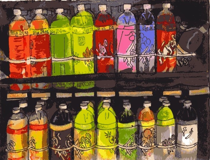
Colorful drinks 5 1/2 "x  7 1/2 "
As an artist, it surprises me sometimes where I notice colors. (Once I noticed some lovely contrasting colored garbage in the trash can at work) I also liked the bright colorful drinks in the cooler at a convenience store. I bet I'm the only person taking pictures of drinks in the cooler. Drawing the shapes was a bit boring though since they're identical. It was fun using bright colors and was mostly a study in something new that I've not painted before. It's good practice changing the subjects so I don't get in a rut.
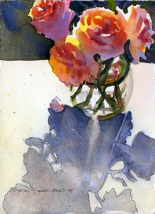
Rose Study 5 1/2" x 7 1/2"


I put bright colors (yellow and peach) on the roses first, then added darker colors on top after the first colors dried. I made up the dark background to contrast with the lights on the flowers. I like how the blue I added on the shadowed petals contrast cool (blue/purple) against warm (yellow/red/oranges) in the flowers. That usually works if you layer watercolors (called glazing) instead of adding the blue in the initial layer of color. Too much mixing of colors on your paintbrush usually makes mud.